SM
Sheby M
Loading portfolio experience
Loading portfolio experience
Business Operations, Healthcare · Automation, Web App, Dashboard
An interactive Streamlit dashboard that transforms health survey responses into clear demographic insights, health-score trends, and filterable visual reports.
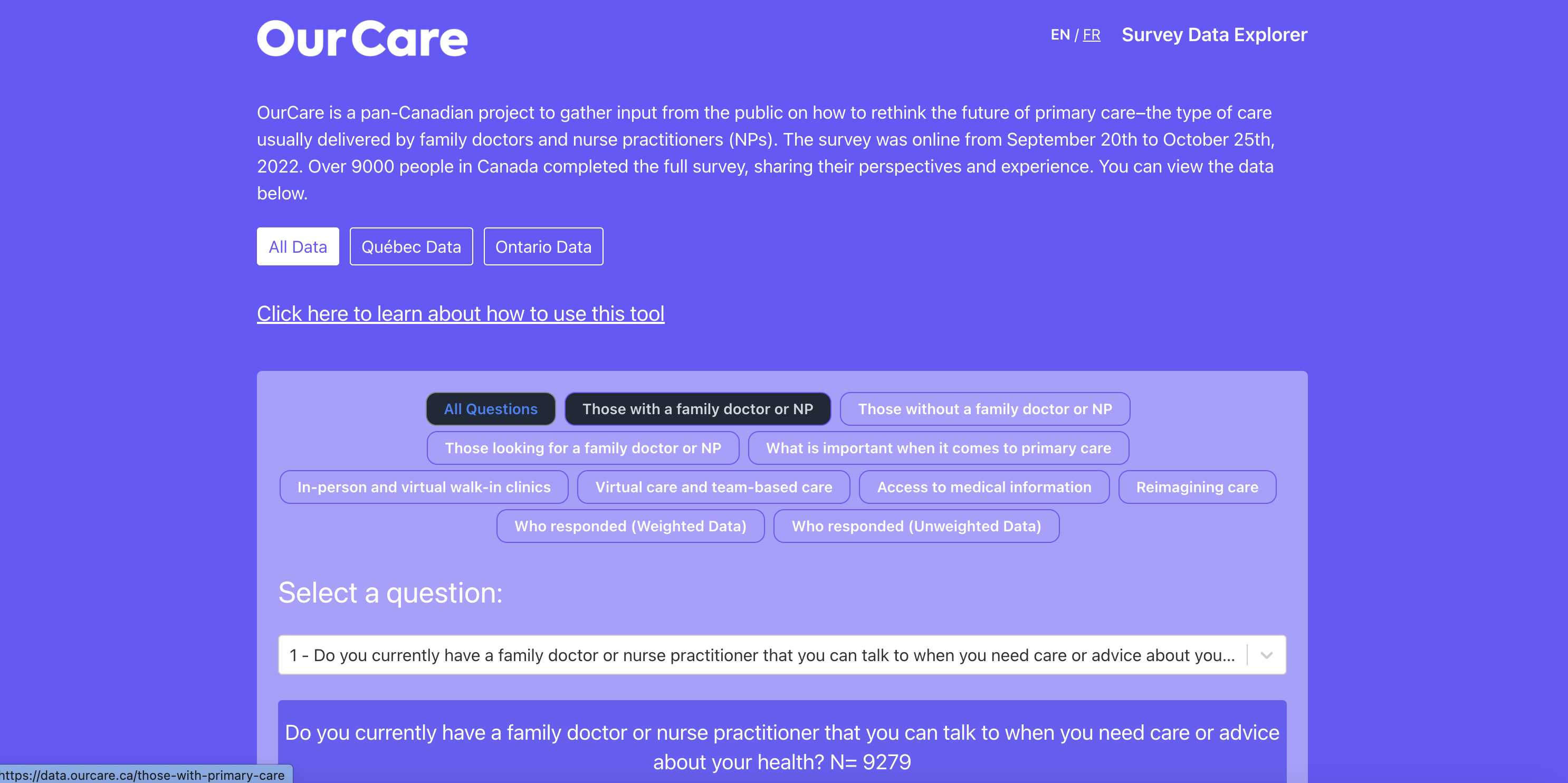
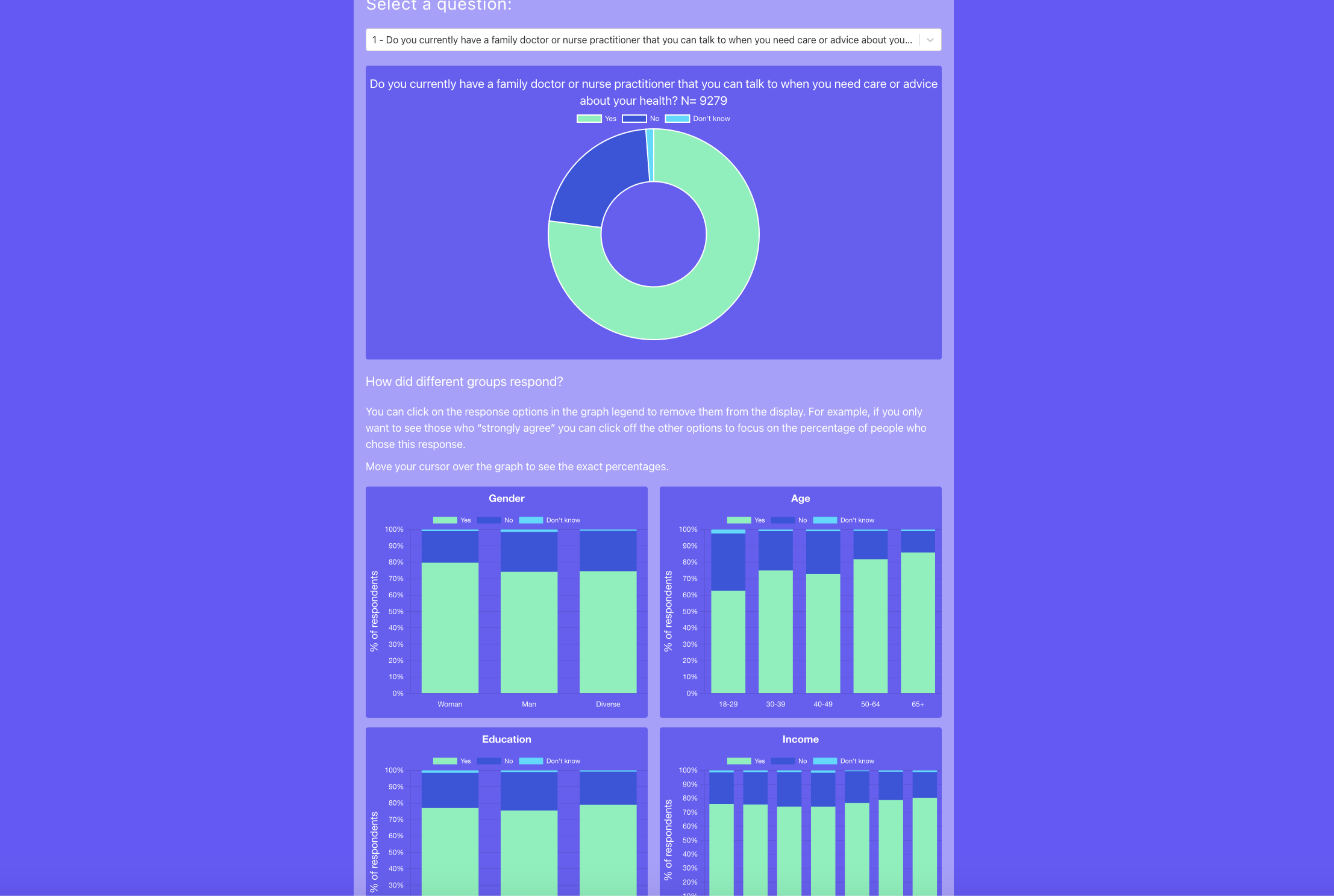
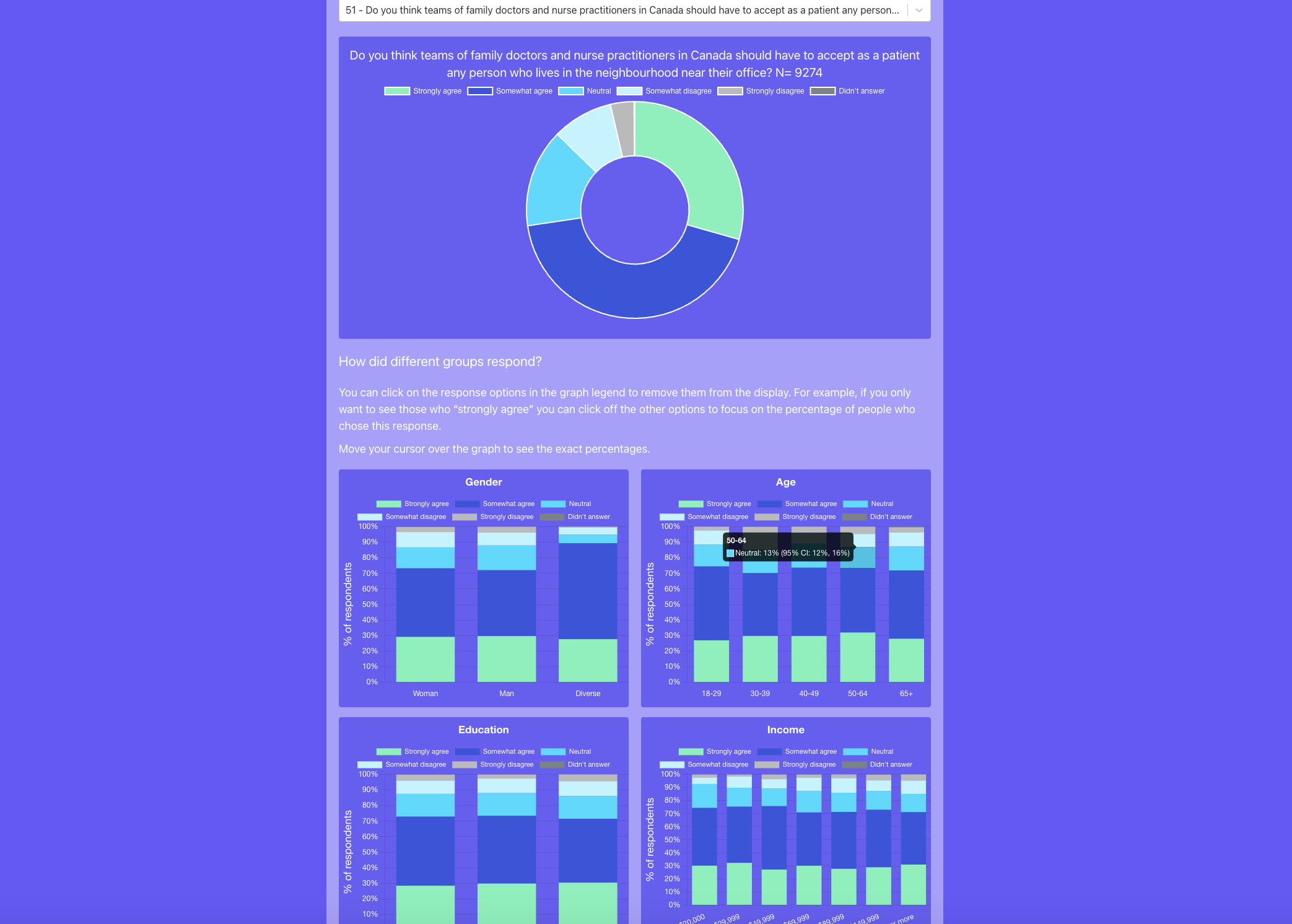
Health survey responses were stored in spreadsheets and were difficult to interpret across different participant groups. Analysts had to manually organize responses, calculate health scores, compare demographic segments, and prepare separate charts whenever stakeholders requested a new view of the data.
I developed a customized Streamlit dashboard that imports and cleans survey data, calculates health scores, and organizes responses by location, age group, gender, and other available demographics. Users can apply multiple filters, compare participant segments, review key performance indicators, and explore interactive charts that update instantly. The Python processing layer validates incomplete values and prepares consistent datasets, while Plotly and Matplotlib present score distributions, response patterns, demographic comparisons, and health trends in a clear visual format.